Saving Images for Print vs Social Media
```html
The Fundamental Divide: Resolution and Color Modes
When preparing images for print or social media, the first consideration is resolution. Print demands high-resolution files—typically 300 DPI (dots per inch) or higher—to ensure crisp details on physical surfaces like paper or canvas. In contrast, social media platforms prioritize speed and accessibility, rendering 72 PPI (pixels per inch) sufficient for screens. A common pitfall is assuming a single file can serve both purposes, leading to pixelation in print or unnecessarily large uploads online.
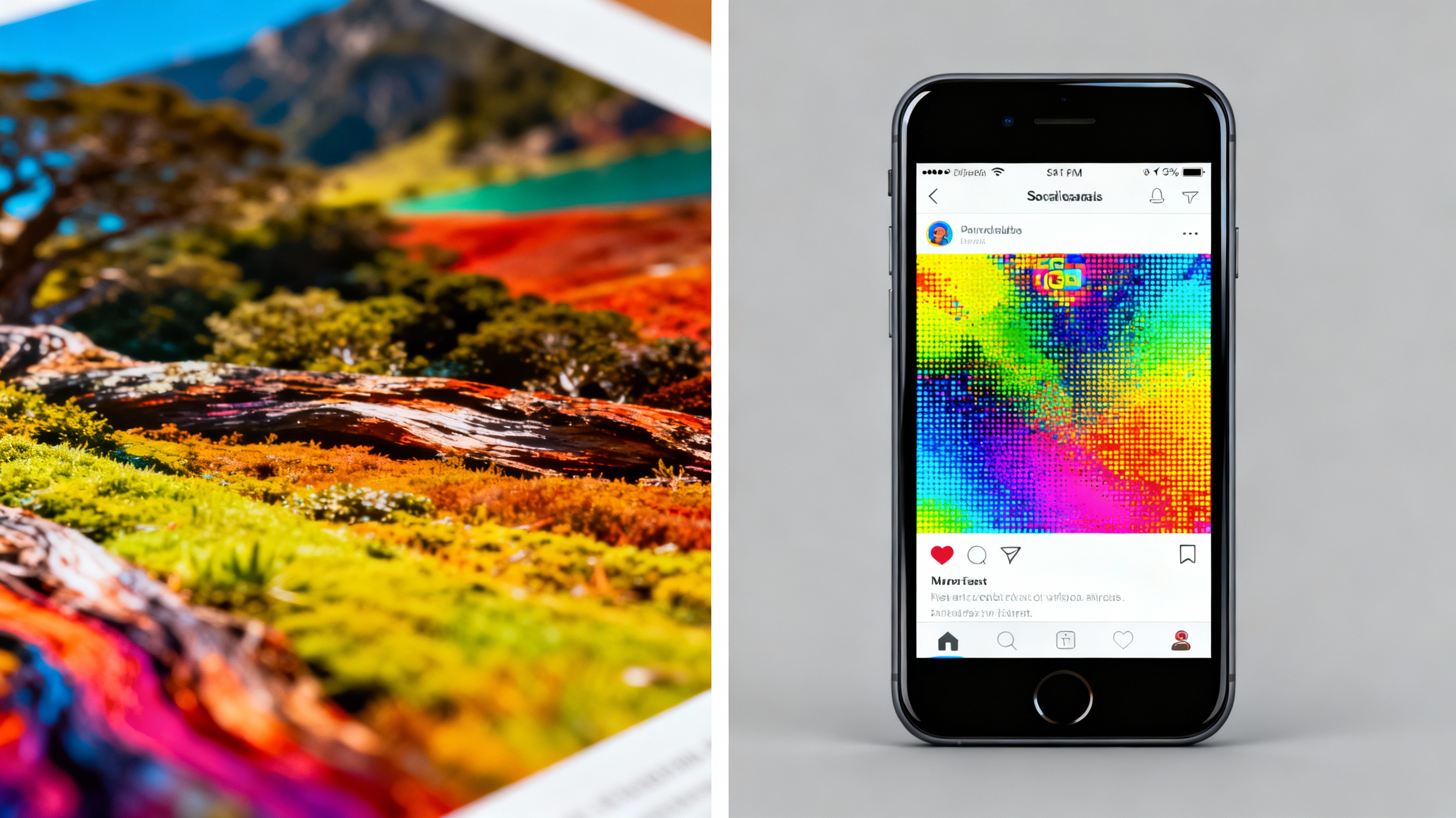
Color modes further widen this divide. Print relies on CMYK (Cyan, Magenta, Yellow, Key/Black) to replicate colors through ink mixing, while digital platforms use RGB (Red, Green, Blue) to project light-based hues. Ignoring this distinction can result in muted prints or oversaturated social media posts. For instance, a neon-green logo may dazzle online but appear dull in print unless adjusted for CMYK’s narrower gamut.
File Formats: Compression and Compatibility
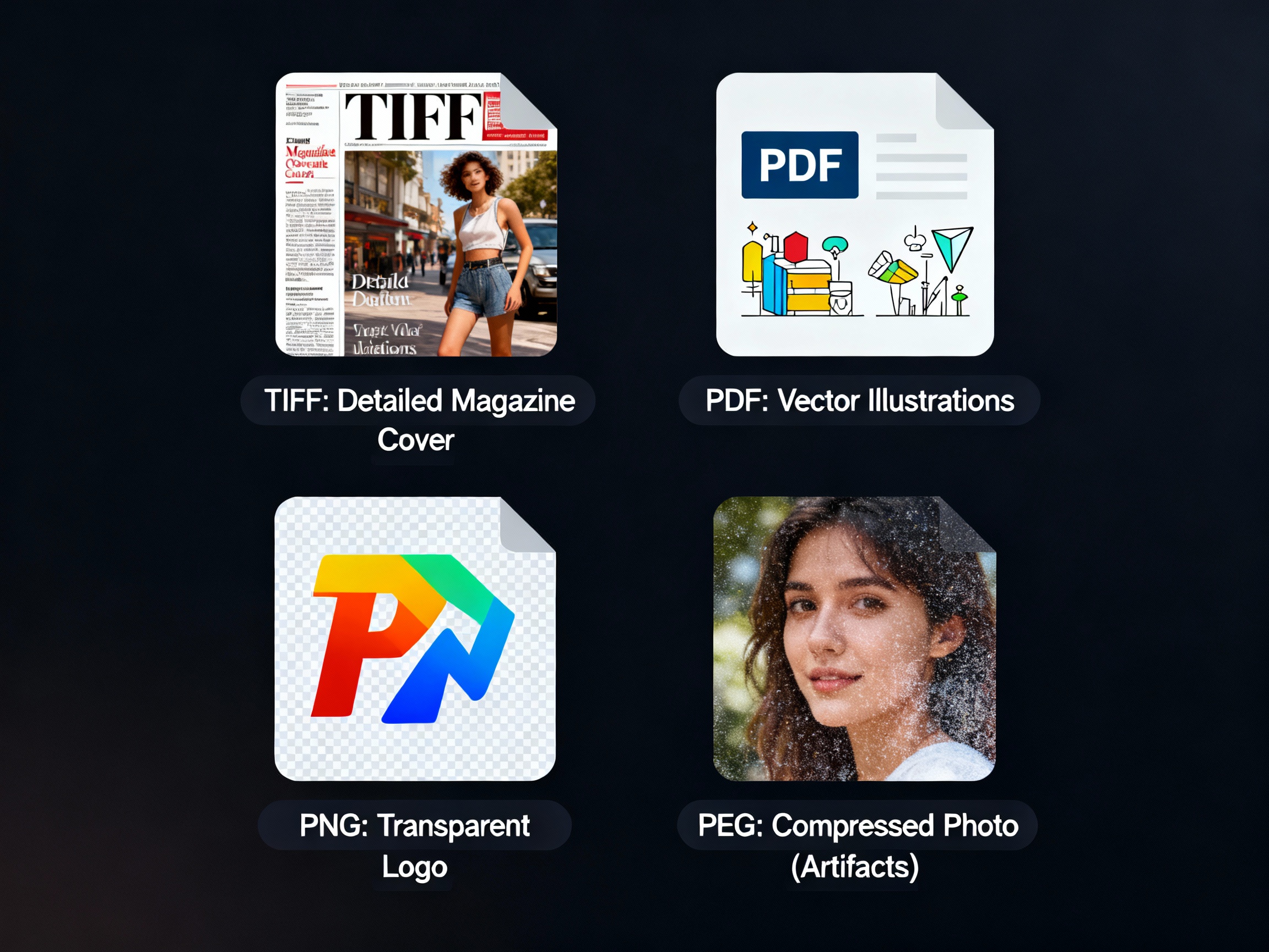
Choosing the right file format balances quality and practicality. Print-friendly formats like TIFF or PDF preserve layers and metadata, ideal for professional presses. JPEGs work too, but only at maximum quality settings to avoid compression artifacts. Social media, however, thrives on efficiency. Platforms like Instagram and X (Twitter) compress uploads aggressively, making PNG ideal for graphics requiring transparency, while JPEG suffices for photographs—if optimized correctly.
Compression is a double-edged sword. Over-compressed JPEGs introduce “noise” in gradients or shadows, while oversized files slow webpage loading times. Tools like Adobe Photoshop’s “Save for Web” or online compressors like TinyPNG strike a balance, reducing file size without sacrificing visual integrity.
Aspect Ratios and Platform-Specific Dimensions
Print dimensions follow physical constraints—a 4x6 postcard or a 24x36 poster. Social media, however, operates in a fluid digital space where aspect ratios change per platform. Instagram carousels favor 4:5, while TikTok thrives on 9:16 vertical video. Adapting a single image across formats often requires strategic cropping or adding borders to maintain focal points.
Designers often create templates tailored to each platform. For example, a brand promoting an event might design a print poster at 11x17 inches, then derive social media assets by cropping sections of the original artwork into square or vertical formats. Tools like Canva or Adobe Spark simplify this process with pre-sized templates.
Color Calibration and Accessibility
Print color accuracy hinges on calibration. Professional presses use Pantone guides and ICC profiles to ensure consistency across batches. On screens, however, colors shift between devices—a photo may look warmer on an iPhone than on a budget Android. Social media creators often test posts across devices or use sRGB, the default color space for web, to minimize discrepancies.
Accessibility is another critical factor. Social media graphics should incorporate alt text—a concise description for screen readers—and high-contrast colors for readability. Print materials, while not needing alt text, benefit from tactile elements like embossing or braille for visually impaired audiences.
Workflow Optimization for Cross-Platform Use
Efficient workflows bridge the print-digital gap. Start with the highest-resolution file possible, ideally in a layered format like PSD or AI. For print, export CMYK TIFFs or PDFs with bleed margins. For social media, resize derivatives to platform specs in RGB, sharpening lightly to counteract downsizing. Cloud storage solutions like Google Drive or Dropbox keep versions organized.
Automation tools save time. Photoshop Actions can batch-resize images, while platforms like Buffer or Hootsuite schedule social posts in advance. Regularly audit files to update outdated brand colors or logos, ensuring consistency across all mediums.
Balancing Quality and Adaptability
The key to mastering both mediums lies in preparation. Understand the technical requirements upfront: resolution, color modes, and dimensions. Use non-destructive editing to preserve flexibility—adjustments layers in Photoshop or luminosity masks in Lightroom allow tweaks without degrading quality. When in doubt, consult print vendors or platform guidelines; their specifications are gospel.
Ultimately, neither print nor digital is inherently superior. They serve different purposes. A luxury brand’s embossed business card conveys tactile prestige, while an influencer’s Instagram Story thrives on ephemeral, eye-catching motion. By tailoring assets to each medium’s strengths, creators ensure their message resonates—whether in hand or on a screen.